I already knew what I'm about to see even before I clicked on this thread.
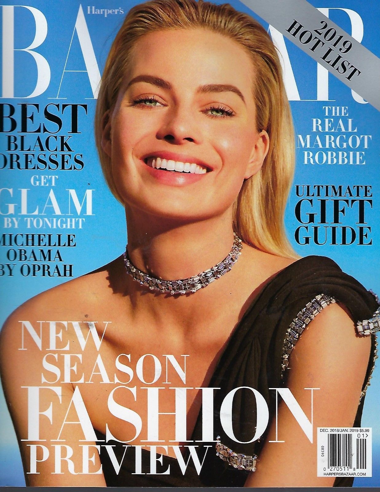
What HB US is lacking in terms of its cover is the art direction. It's okay
to have a formula when it comes to their cover. Cosmo UK had these
white backgrounds on their monthly covers years ago, but it actually worked.
HB covers on the other hand does not excite me at all. "Lazy" is the term that
I'd associate to it's art direction, and what bothers me is that the layout of their
pages are actually decent to impressive.
They should stop putting "The Best Bag and Shoe" "The Hottest Dress for ----"
or the gigantic "FASHION" on the cover since it's pretty obvious that they're
gonna feature fashion as it is a fashion magazine.