Dolce & Gabbana S/S 2010 : Madonna by Steven Klein

Wow. This is not what I expected... But I kinda like it. Surprisingly. It's funny, her last campaign for LV was almost more Klein-esque than this this one.

It really doesn't look like a campaign, as others have said. I think I need to see it in print to know how good an ad it is, rather than how good the images are as editorial photos...
 
it's way different from the past campaigns but still, different
could have been something else, something livelier. this looks dead
right on. seriously, Madonna washing dishes and picking over scraps
in the kitchen qualifies as a campaign? :yuk:
 
Wow i am shocked how much i like this, geez well done Klein. Madonna looks good imho, even the weird face expression works haha.
 
Madge's face is morphing into something entirely different in each shot.The campaign feels like a editorial but it isn't that bad.
 
I really like it after they add the D&G type. Something fresh and different from the past D&G ads. Now I can't wait for the 2nd line ad. Hope it's follow the mainline as well.

I love her expression. Madge's like 'Hey, I'm a hot mama, how are you? x"
 
Well, I'm not a fan of celebrities in campaigns but compared to the previous Louis Vuitton/ Madonna disasters, this looks great.

She's a 50plus year old woman, still looking great. She's not an 18 year old girl anymore who can spread her legs in just about any vulgar position. It's appropriate and somehow subdued. Never expected this from a Dolce campaign so all in all a pleasant surprise
 
well well well not that bad, but were are the clothes ? i mean we see mouth, we see boobs (they're even the center of the pic !!!) but to me, for the moment, this is more a madonna add than a DG campaign
 
well well well not that bad, but were are the clothes ? i mean we see mouth, we see boobs (they're even the center of the pic !!!) but to me, for the moment, this is more a madonna add than a DG campaign

I'm glad you said it because all I notice are her breasts . :ninja:
 
i don't think this is the actual campaign...
it looks like an editorial using images from the campaign (because the actual campaign wouldn't have an interview with stefano gabbana)...

Thats what I'm hoping for, because I don't like this.
 
This is a bad joke!
Madona´s face looks awful, and I can´t even see the clothes.
 
I adore it. I love the whole sexy poor girl with 4 kids abandoned by her soldier husband, making ends meet, whatever.


I know they say it was inspired by Monica Vitti but it's very Sophia Loren in two women also.

I'm not sure about the blonde hair, maybe she should've used dark hair to further capture the ethnic traditional look.

And how amazing is the crucifix on her gorgeous breasts??? I'm dead.
 
it looks quite italian and unexpected i love it..much better than LV
 
madonna is italian, after all. i'm glad that dolce and gabbana continue to challenge us with something out-of-the-box yet entirely within our frame of reference. this hearkens back to the gisele campaign where she found herself in fabulous dolce and gabbana yet in traditional -- stereotypical -- italian trappings. it really taps into a moodiness we all feel as a result of this economic meltdown and falls into the trend we saw at chanel rtw of dressing up to play poor.

(source:bwgreyscale.com)
 

Attachments

  • old dolce.JPG
    old dolce.JPG
    250.6 KB · Views: 30
I actually quite like, but I feel Meisel could have done a better job.
 
I certainly don't hate the idea - but it seems to be missing the magic of the Gisele ones, where it really was like an artfully constructed still from a film, because if your eyes strayed from the model, there was still plenty to see in the secondary characters in the frame. There were layers of storylines in the Gisele version.

Though it makes me wonder if we should expect Madonna to turn up as the new Versace woman in two seasons' time, especially considering she's done that gig several times in the past.
 
I thought this was an editorial, but I quite like this. It's not as "campaign" like without the Dolce logo, but I think overall I like the feel.
I think I'll wait until a confirmation.
 
I'm actually quite surprised to say that from a photography perspective, I love these!

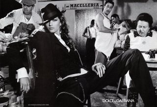
When I stumbled across the headline "Madonna: Dolce & Gabbana's Spring 2010 ad campaign" on another website, my first thought was, "Oh Lord, no." As a personality, I strongly dislike Madonna, and her Louis Vuitton campaign was not only Photoshopped to death, it was generally dreadful (though this is something I've come to expect of LV campaigns at this point).

But seeing the photos, I was instantly swayed in favor of them. The airbrushing, though def. there, isn't as shamelessly obvious as in the LV campaign, nor have they tried to make excuses for it by shoving all kinds of other Photoshop filters down our throats.

Now, Madonna has never been a great actress, and age has taken its toll on her -- combine that with airbrushing and some of her photos will inevitably be a bit stiff. But there's something very lovable about her in these, and def. something ironic. Apart from the second picture -- in which her eyes look rather lopsided, while her expression doesn't really fit the situation -- I'm really feeling these. Photography-wise, anyway. I'm so happy to see Madonna's softened her image from those ridiculous Hard Candy days; it's really made her years younger and more approachable.

From an advertising perspective, however, I will admit I'm not sure this is the best representation of D&G. Like someone already pointed out here, the pics are rather ed-esque, and the clothing isn't that visibly displayed. But, on second thought, I find the ambiguity kind of charming, actually. Come to think of it, it's one of the reasons I've never liked LV as a label -- because I don't like having labels shoved in my face.
 

Users who are viewing this thread

Back
Top
monitoring_string = "058526dd2635cb6818386bfd373b82a4"
<-- Admiral -->