US Vogue May 2019 : Kim Kardashian West by Mikael Jansson

You know it’s 2019 right? What exactly makes drag tacky and tasteless?

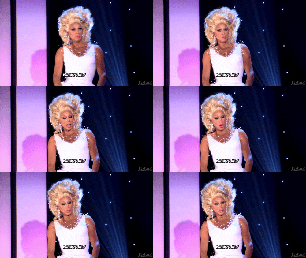
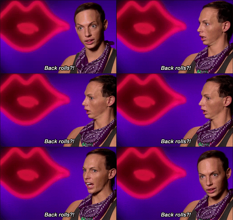
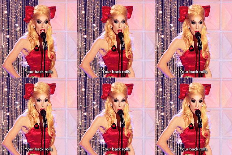
Back rolls!
lS5cN2HJ_o.gif
bCkkIQBL_o.gif
XeDd6iJ4_o.gif


source: giphy.com
 
The photo featuring Keiynan and Ezra is everywhere now!
 
The ignorance on this forum with regards to the "unconventional" takes on fashion is both laughable and offensive sometimes. And we're supposed to talk about fashion, here? Last time I checked, fashion and its vast array of expressions have no limitations. Anna has had her questionable moments but I applaud the level of unapologetic queerness in some of her editorials this month.
 
So odd and refreshing not to see a single Gucci by Michele look in the editorial, although it's (rightfully) quite heavy on the Moschino.

Agreed, to do a camp story with looks from Michele's Gucci would just be setting yourself up to fail because the brand itself does it best. I'd have liked to see some of the dramatic Balmain pieces and maybe more labels who deal with camp in an intellectual way. Brands like V&R. That editorial does not appeal to me at all. It's as contrived and overdone as a pink flamingo in a shopfront. I can get that sort of thing in Dazed if I so desperately seek it.

At face value, the issue looks good. But Anna's editor eye must've failed her this time because the Hawkesworth feather edit is all over the place. Or maybe it was intentional.
I'm not sure why they didn't just go ahead and give that entire suit story to Anok, because how do you justify giving only one shot to Adut? And Michele's edit is exasperating. Maybe the issue is supposed to appeal to all the impulse buyers it's hoping to catch with Kim's cover and the mention of Ru Paul. That's all fair and well, but what happens next month? How does Vogue plan on keeping these new readers? Should be interesting to see.
 
The ignorance on this forum with regards to the "unconventional" takes on fashion is both laughable and offensive sometimes. And we're supposed to talk about fashion, here? Last time I checked, fashion and its vast array of expressions have no limitations. Anna has had her questionable moments but I applaud the level of unapologetic queerness in some of her editorials this month.

My problem with these men in dresses is that it seems they just threw any dress on them irrespective of fit. When Billy Porter wore a dress to the Academy Awards, he looked regal and majestic. Made me want to put on a dress. This edit does not do that.
 
I think Keiynan's Thom Browne and Moschino fit him quite nicely. But regardless this is an editorial that's not supposed to inspire people to necessarily copy the looks. I don't think the folks at Vogue expect men to look like they've robbed Marie Antoinette's closet by wearing that Vivienne Westwood dress any more than they expect women to don the Giles Deacon swan hat, as fabulous as both would be. It's a celebration of camp and is deliberately over the top and, I'd say, inaccessible. A celebration of an idea, but they're not trying to sell a look. Hence the use of pieces from decades-old collections. The camp is deliberately dialed way up, much higher than Billy's Oscars look. Apples and oranges, in my opinion.
 
A Kardashian getting another cover? Vogue USA is desperate to be with the kids.
 
Oh, I understand why it didn't make the cut. Nice and inoffensive, but forgettable (pretty much sums up Jorden Bickham's styling). And not strong enough as an editorial. Glenda Bailey, however, would not have flinched to use it as a feature.
What Anna could do is use it for her front of book section. Just to liven VLife up a bit. God knows it could do with something, anything interesting.
 
that INDEX spread is fugly. VOGUE used to employ in-house regular still life photogs for their still imagery specifically in the Index pages. In our snap-happy, sexy packaging prerequisite, object obsessed culture, it's discouraging to see that VOGUE is outsourcing and using courtesy images whose origins and photog credits is of no consequence or importance. Oh and Bella's tumblr, IG style is laughable, tacky. I shudder to think what her wardrobe contents would look like if not for those designer labels.

I miss the 90s supers like Shalom, Amber, Trish, Linda, Kirsty, Kirsten, Chandra etc etc whose styles reflected their innate style, spurred by their love for punk/alternative music. They looked like a million bucks in their secondhand, thriftstore finds. Our insta, skimming the surface culture lacks breadth and breeds contempt rather than familiarity and truly "following," new discoveries.
 
There was nothing memorable about this issue after flipping through it - other than the cover. Even the actual editorial with Kim fades from memory.
 
You tell her, Ru! :rofl::rofl::rofl:

Via Vogue:

"The skull-to-eyelash ratio is so physiologically improbable that it’s a good 30 seconds before I realize that Ru is not dressed as any of his familiar alter egos. Rather, he’s a modern facsimile of Queen Elizabeth I, clothed in a billowing gold-brocade skirt, a corset, and a halo of red dreadlocks.

He knows which side is his good side. He knows how the light is hitting. He knows to lower the lashes to half-mast and let them hover there as the camera clicks. And when, after a while, Leibovitz suggests he remove his headpiece, he knows to object.

“It becomes something else without the piece,” Ru says, gesturing to the rest of his puffy-sleeved costume. “The piece sells everything else.”

“Your hair becomes a crown,” Leibovitz says gently. The exchange goes on for two minutes. Finally, RuPaul puts his (combat boot–clad) foot down. Remove the piece, and he is no longer in character. “Everything here is overdone,” he says, motioning again to his look, and then to the surroundings. “The only natural thing about any of this is the light.”

It occurs to me that RuPaul has just offered up a definition of camp. (“The essence of camp is its love of the unnatural: of artifice and exaggeration,” Susan Sontag wrote in “Notes on ‘Camp.’ ”) More remarkably, he and Leibovitz have just unwittingly re-created one of the photographer’s most memorable shoots.

You see, twelve years ago, when Leibovitz took official portraits of Queen Elizabeth II in full regalia at Buckingham Palace, one of America’s most well-known portrait photographers asked England’s longest-reigning monarch to remove her “crown.” (It was a tiara.) A BBC film crew captured the exchange.

Leibovitz: “It will look better—less dressy—because the garter robe is so. . . .”

Queen Elizabeth II: “Less dressy? What do you think this is?”

The queen of the United Kingdom did not want to take off her headpiece. And here in beautiful downtown Burbank, neither does the Queen of Drag.
"
 
You tell her, Ru! :rofl::rofl::rofl:

Via Vogue:

'Leibovitz: “It will look better—less dressy—because the garter robe is so. . . .”

Queen Elizabeth II: “Less dressy? What do you think this is?”'

I'm laughing so hard right now.
Those two exchanges; QEII and Ru, demonstrates why I dislike Annie's work so much.
It's like she doesn't connect with the people she photographs.
I wonder how many of her other subjects weren't as willing to object to her suggestions and we end up with some of the wretched images she's produced over the last ten years.
 
Garbage issue, doesn't look 'American' in the slightest, and damn they had the chance to feature Keri Russell and instead we got a washed up reality star.
 

Users who are viewing this thread

Forum Statistics

Threads
212,613
Messages
15,191,215
Members
86,523
Latest member
GodMahdi7
Back
Top
monitoring_string = "058526dd2635cb6818386bfd373b82a4"
<-- Admiral -->