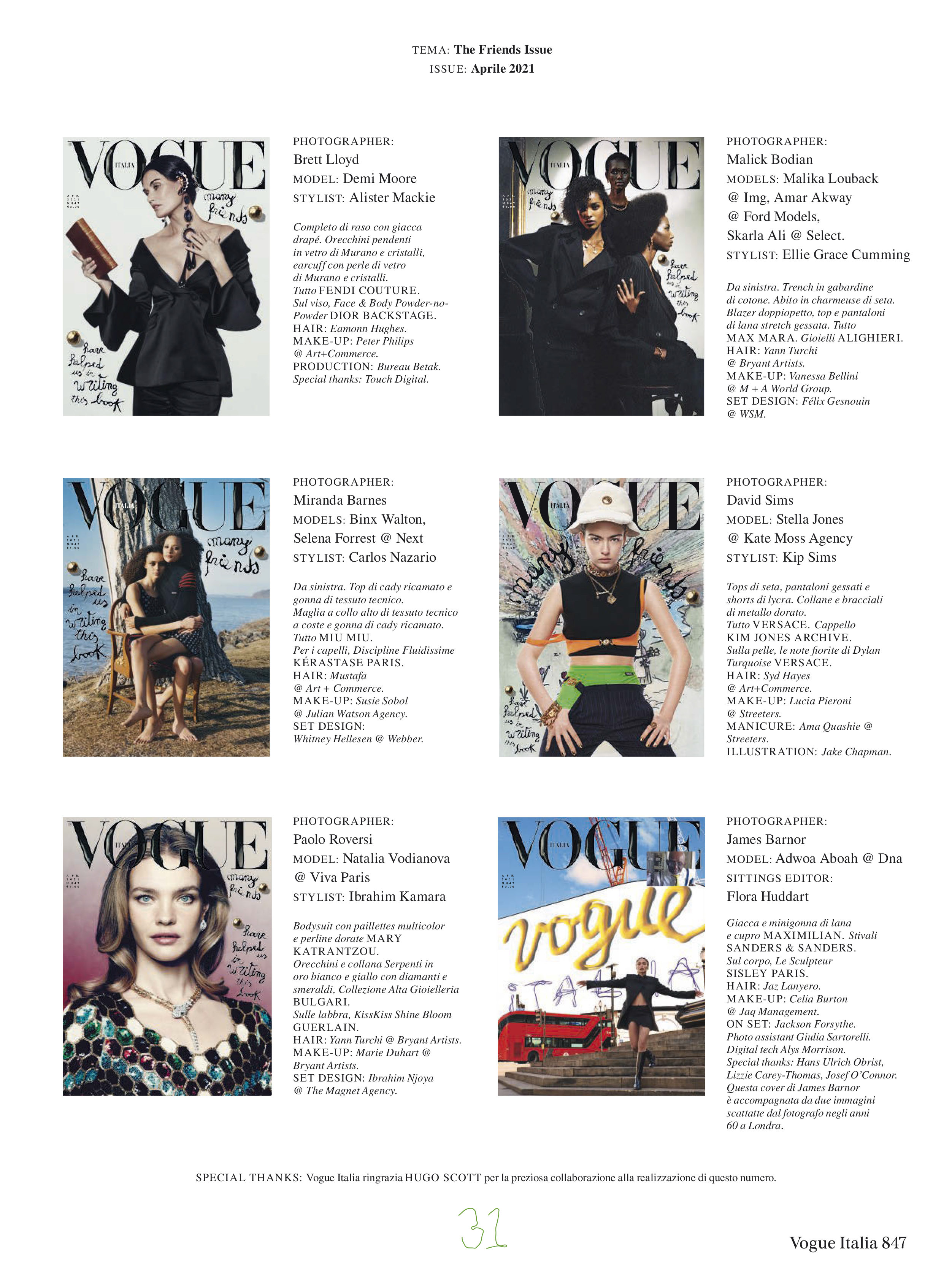
Vogue Italia April 2021 : The Many Friends Issue

I cannot believe that’s Roversi’s editorial. he lost it.
Farneti’s guidance does seem to pull out the worse on everybody... models, photographers, covers, editorials...

Demi’s b&w pictures are nice and Malika’s and Selena’s eds have some nice shots.

that’s all.

Im sure that Vogue Italia’s sales are down. come on, I cannot believe that this guy’s work is thriving. it’s an absolute poverty edition after edition.
I just want him to go away. please.
 
I absolutely adore Natalia and Paolo Roversi, but I have to say this editorial is really disappointing, especially given the quality of the work these two have produced in the past... If we just focus on their work for Vogue Italia, editorials like A Girl of Singular Beauty (September 2004), or Like a Painting (September 2006) were absolutely iconic, so compared to this, it is hard not to cringe...

And then if you compare it to the stunning and original cover and editorial of Natalia by Elizaveta Porodina just last month for Vogue Russia, the contrast is stark.
 
It is obvious that Roversi has lost it, his work past 5-6 years has been so mediocre and amateur. Also, it is clear that Natalia doesn't give a f*ck about her modelling anymore and she is there just for gigs and exposure. Her W with Meisel, VI with M&M, now here with Roversi, she became so lifeless and boring, in all her edits she's giving nothing.
 
The only redeemable content in this issue is the ed with Malika/Amar Akway/Skarla Ali, I feel some emotion when I see it. Everything else is so blah and amateur looking.
 
So sad that Sims editorial also Stella as well...some of Demi shots,some of Roversi shots and some of Malika shots. i disagree on the Roversi editorial it works even it’s a little meh but a lot of things take in consideration when making editorials for magazines, and with that EIC, well...the rest of the magazine is for the trash bin...

What gets me most it’s the superior attitude they seem to have and when i say they i mean Farneti and company.

So as someone suggested previously he is not worry for magazine sales, obviously, so he is only worry to be “artistic” and “deep” and get likes and followers....
 
The whole issue just just scream i-D rather Vogue. Quite mediocre issue, but I guess it's still better than what he has offer so far.

Demi ed is nice, but that painting is more Courtney Cox/Jennifer Connelly. Stella ed is terrible, she just standing there look annoy. David Sims works lately feel so uninspired, and his son is definitely not helping. Roversi and Natasha is on autopilot, maybe this is the result when you have nothing left to prove. the only good shot in Binx & Selena ed is the last one. Nickerson ed is a glorified Fendi advertorial, why bother to hired Amanda Harlech when everything is a full look. Malick Bodian ed is the only good ed in the whole issue, but if his photography style is just going to be derive from Malick Sidibe then he should just focus on being a model. Philips ed is just an extension of A magazine curated by Kim Jones.

Overall this just a just a big advertisement for Kim Jones and LVMH.
 
Love the edits! I just wish they’d stop trying so hard to be all conceptual and edgy for the covers
 
I forgot the post this earlier, apparently there is a sixth cover with Adwoa Aboah by James Barnor, no cover-story just an article using the same image as the cover. Honestly, I can see why they forgot to post it because it's the ugliest out of six.

Here's all six:
wOiVys17_o.jpg

Vogue Italia Digital Edition
 
The 3 of the left was enough...but this stupid man always needs more and the he screw things up...

There is nothing people can sign? Petition for him to go away and never touch a magazine again?
 
check what Lori Goldstein is up to nowadays.
Logo by Lori Goldstein
gosh, how come that A-rated stylist and fashion consultant with a portfolio to kill for turned into a British granny with flower boho dresses from flea market. Guess its dementia

:lol: ASF, she has become the parody that was VI January 2012 - the irony!

Malika, Amar and Skarla gave us some good images here, but the story is totally incohesive. I won't comment on the rest. I see Ib has the gall to make Roversi regurgitate motifs from his other work (Vogue Hommes with Pavarotti) which is a bit cringe worthy. Not to mention that Natalia models as if she were the richest "real housewive of whatever"...

Demi ed is nice, but that painting is more Courtney Cox/Jennifer Connelly.

Best comment so far :rofl:. This is why I will always come to the VI threads, even if Farneti continues to drag this magazine through filth.
 
Omg, such an awful, awful issue. And the styling?? :sick::sick::sick:
Even the Ibraham Kamara, Mackie and Sims edits are terrible. And Peter Philips doing Google doodles yet again?
You can argue that all Kim's friends are past it creatively speaking. They've had their moment and just won't go away because they're institutionalised. But what about Malick Bodian, who is a new photographer? I'm slowly warming to his work but what I seeing here is so off-putting and disjointed. He clearly tried too hard to fit in with the 'edgy' crowd.
Thank God you've saved our eyes from the Adwoa edit @aracic , which is bound to be an eyesore, I'm sure.

The only edit I can tolerate somewhat is Amanda Harlech's.
 
If someone is interested in the “Art Direction” ... i can Imagine Enninful and Alt Whatsapp messages... LOL

 
That editorial by Malick Bodian is stunning which is ironic since they picked the worst image from it as a cover! They should have simply shot those three models for the cover and maybe Demi Moore. The other covers and the bleeding masthead are not a good look. I guess 'Peter and Kim' is an advertorial
 
That video triggered me.

Imagine the intern who applied at Vogue only to find themselves making letters out of paper clips and scanning them....

I cannot, for the life of me, accept the fact that Conde Nast allows their time and resources to get wasted in the creation of these amateur art directions! Imagine paying people to make a tagline out of acrylic paint? How many hours were wasted in creating those crappy leaf/paper clip/ribbon/yarn texts that they scan and use. And imagine paying creative directors only for them to give you that. Short-changed at best! I CANNOT. What is going on?

I'm 100% sure that there are tons of BETTER up and coming art directors in Italy.

And Vogue Italia's main IG account had the audacity to upload those behind the scenes videos? Those contorted paperclips are an embarrassment to the legacy of this brand and the fact that they thought that it would be cute to upload it says a lot about what goes on inside their offices. A big no.

When Giovanni Bianco left, I took a huge sigh of relief and thought that things will actually get better for VI. Oh what a big joke. It got worst. Foolish of me to think that the art director will be better than the person who appointed them. Nope. You're just as good as the person who saw potential in you. Never thought I'd see the day of me wanting Bianco back because at least he used fonts, you know the real ones.
 
Last edited:

Users who are viewing this thread

Back
Top
monitoring_string = "058526dd2635cb6818386bfd373b82a4"
<-- Admiral -->