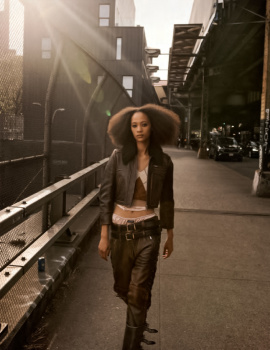
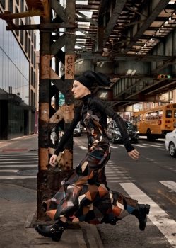
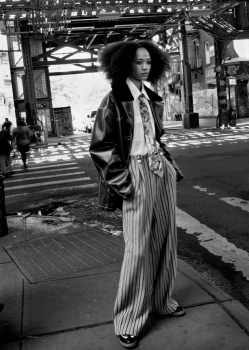
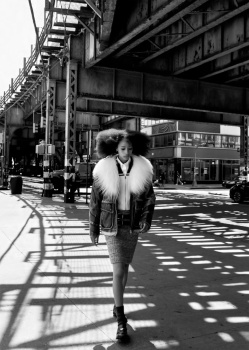
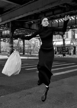
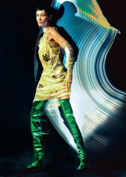
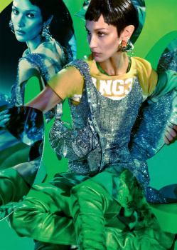
My subscription copy has just come through the door - unlike the scans above, nearly every editorial has some kind of white border around the images, so instead of the page being an immersive experience, you feel very distanced from the images. See those images above? That's not what you get.
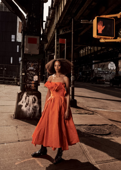
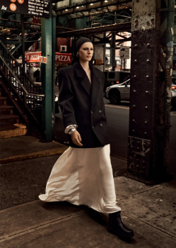
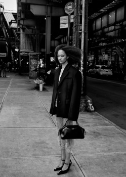
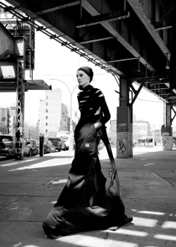
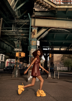
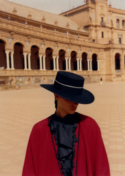
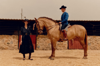
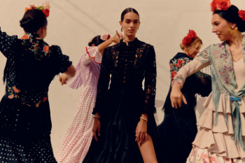
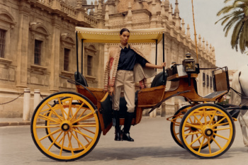
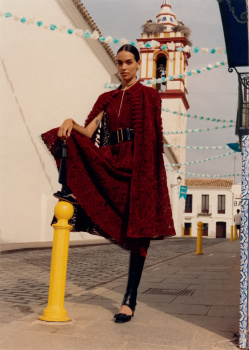
Instead of the page being a seamless presentation of a street scene where you can suspend reality and feel part of it, there's a big white border glaring out at you. Instead of a highly coloured image being a sensory experience, there's a big white border working against the vibe of the colour. The four landscape images in Seville Liberties are tiny, I'm having to peer at them like I'm Mr Magoo.
And the white borders are slightly different for every shoot, so there's not even consistency in their use, and the borders being so obvious, this inconsistency stands out.
This has been a feature of UK Vogue since the start - but in this issue, it's used in practically every editorial, so the over-use is glaring. Whatever effect this is supposed to achieve, it's doing the opposite. It's like a design student who's seen something they really like and is going through a phase of doing it to death because their repertoire is still at the narrow stage.
STOP WITH THE WHITE BORDERS. Just let the images speak for themselves instead of stuffing them into white boxes, and looking like you can't afford to print to the edge of the pages.
Vogue, set yourself a challenge - one issue with no white borders around any of the editorial images.
 ), does anyone knows when this issue hits the stands?