You are using an out of date browser. It may not display this or other websites correctly.
You should upgrade or use an alternative browser.
You should upgrade or use an alternative browser.
Interview December / January 2010 : Penelope Cruz by Mikael Jansson
- Thread starter birdyandme
- Start date
j'adorekapusta
Active Member
- Joined
- Jun 30, 2007
- Messages
- 1,791
- Reaction score
- 0
Thank you, BerlinRocks, for sharing the link.
feels like the DIY approach is the latest trend for fashion editorial. first Vogue Italia, now Interview... seems like a good way to bring some personality and intimacy into the spread. is it what they call 'bring some life into it'?
i loved Anouck's part of mr. Hack's picture, as well as Olivier Zahm, NV and LSD (God, this ABC-ing sounds pretty ridiculous). but MAS totally steals the show with her Guy Bourdin's image. i wish some pictures would look less Anne Leibovitz for Vogue US though. but that must be about someone's ideas of what a beautiful picture is. which is quite psychological if you think of it.
anyway, the whole thing is quite amazing.
surrealseven
Active Member
- Joined
- Jun 27, 2008
- Messages
- 3,513
- Reaction score
- 3
testinofan
███████████████
- Joined
- Aug 24, 2004
- Messages
- 7,407
- Reaction score
- 123
Great ed of Sorrenti
Fiercification
Well-Known Member
- Joined
- Apr 17, 2008
- Messages
- 6,286
- Reaction score
- 1,485
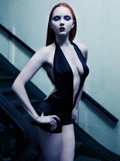
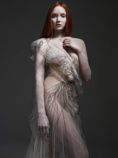
That Marc Jacobs dress... , Lily has seriously been winning me back recently, that ed is gorgeous. I can't wait to get my hands on this issue
 , Lily has seriously been winning me back recently, that ed is gorgeous. I can't wait to get my hands on this issue
GroovyDolce
Member
- Joined
- Sep 20, 2004
- Messages
- 352
- Reaction score
- 0
This is brilliant! Does anyone have more photos of Tom Ford's editorial?
JuiceMajor
Active Member
- Joined
- Jul 8, 2005
- Messages
- 4,509
- Reaction score
- 1
Look forward to reading Tom's interview.
j'adorekapusta
Active Member
- Joined
- Jun 30, 2007
- Messages
- 1,791
- Reaction score
- 0
Look forward to reading Tom's interview.
it's up on the website. http://www.interviewmagazine.com/film/tom-ford-a-single-man/
does anybody have the scans of The Sartorialists edit by Mikael Jansson?
i've only found one picture in Bruce Machado thread.

bananasmodels.com via tfs' jess93
TheCheekyCritic
Member
- Joined
- Nov 29, 2009
- Messages
- 650
- Reaction score
- 0
I'm apparently the only person here who really disliked the cover.  I kinda like it here in the minority, though. Everything's very cushioned.
But really, I will never get over the hideous Photoshop job they did on Penelope Cruz. Heck, they even edited out the straps of her dress/top in the original photo for the cover. And don't get me started on the colors and crop. It's like a poor man's copy of the striking Kristen Stewart cover from earlier this year. And I don't even like Kristen.
(Not that I like Penelope Cruz, either. )
)
 I kinda like it here in the minority, though. Everything's very cushioned.
But really, I will never get over the hideous Photoshop job they did on Penelope Cruz. Heck, they even edited out the straps of her dress/top in the original photo for the cover.
 And don't get me started on the colors and crop. It's like a poor man's copy of the striking Kristen Stewart cover from earlier this year. And I don't even like Kristen.
(Not that I like Penelope Cruz, either.
 )
)La bordélique
earthbound
- Joined
- Mar 2, 2006
- Messages
- 4,703
- Reaction score
- 8
^^ That editorial was actually in the previous issue, with Kristen Stewart on the cover.
j'adorekapusta
Active Member
- Joined
- Jun 30, 2007
- Messages
- 1,791
- Reaction score
- 0
^ oh haha
i thought so at the moment but Penelope's cover on the website got me all wrong.
thanks for clearing this up.
i thought so at the moment but Penelope's cover on the website got me all wrong.
thanks for clearing this up.
KoV
The Fault in Our Czars
- Joined
- Sep 17, 2009
- Messages
- 6,409
- Reaction score
- 9,933
This is brilliant! Does anyone have more photos of Tom Ford's editorial?
There's only two photos of him, unfortunately. The two photos are at the top of the first and second pages of his interview:
http://www.interviewmagazine.com/film/tom-ford-a-single-man/
Similar Threads
- Replies
- 91
- Views
- 23K
- Replies
- 55
- Views
- 16K
- Replies
- 68
- Views
- 18K
- Replies
- 87
- Views
- 16K
Users who are viewing this thread
Total: 1 (members: 0, guests: 1)
New Posts
-
US Harper's Bazaar Winter 2025: Meghan, Duchess of Sussex by Malick Bodian (13 Viewers)
- Latest: callmejaeden
-
-
-
-


 It's gorgeous nonetheless.