Louis Vuitton F/W 09.10 : Madonna by Steven Meisel

^ :lol::lol:
SS 09 campaign was so much better, I did actually like it.
 
I like how the shadow falls on her face, it makes her look soft and inviting. It's almost like a painting by Tamara de Lempicka.

I can see that maybe in the creases of the silk and the perfection of her fingers, but not in the shadows.
Maybe it was a suggestion she made herself? Seeing as she owns a large collection of Lempicka . .

It reminds me of the Akris F/W 08 campaign, only the model didn't have a ridiculous smirk on her face.
 
I prefer someone else to replace her. The picture reminds "Alice in Wonderland". In my memories Alice was much younger:innocent::P
But I adore the picture. So fairytale and sweet:wub:
One thing-POP Queen. She definately lost her face:stuart: Or is it a deception? This is not Madonna, but her young clone :shifty::wacko:
 
The more i look at this, the more angry and insulted i get! To think the amount of money spent (Meisel and Madonna's astronomical fees mostly!) and to produce such result is simply criminal!!

I don't mind airbrushing or unrealistic images in ads, after all advertising is all about pretense in order to sell the product, but i would rather stab a fork in my eye balls than buy anything from there!! She looks like a corpse, not the look i would want to emulate.

And just to think how amazing this could have been with any model, sheesh!

Rant over. :rolleyes:
 
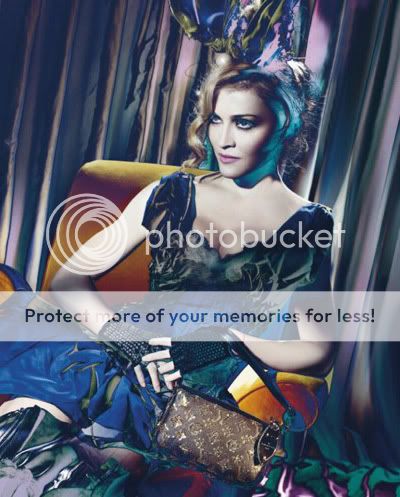
I have to say I love this, I was not so excited that Madonna was in the campaign again but i think it looks amazing:woot: I love the fairytale doll vibe and photoshopped aside she looks awesome love the clothes and the styling, really excited to see the rest of the shots I am in love with all the looks in this collection:heart:

^i agree with you my dear. :flower: :smile:
 
The more i look at this, the more angry and insulted i get! To think the amount of money spent (Meisel and Madonna's astronomical fees mostly!) and to produce such result is simply criminal!!

I don't mind airbrushing or unrealistic images in ads, after all advertising is all about pretense in order to sell the product, but i would rather stab a fork in my eye balls than buy anything from there!! She looks like a corpse, not the look i would want to emulate.

And just to think how amazing this could have been with any model, sheesh!

Rant over. :rolleyes:

TBH there is something about the pic I like.....but just reading you're post really puts it all in perspective, the expense opposed to the end result is certainly not worth it.
 
I hate the color thing on her hair. This is so boring.
 
photoshopped to perfection, it works but the pictures loose the "reality" factor.
actually I like these pictures better than the previous lv-ad with madonna.
 
two new ads:

6a00e54fb7301c883401157092aa6b970c-800wi


6a00e54fb7301c883401157187e1ce970b-800wi

ohlalamag.com
 
Last edited by a moderator:
. . I thought the Louis Vuitton collection was okay, but chic would be the last word I would use to describe it.
 
MadonnaforLouisVuitton03.jpg

Not SO CHIC, untagged images, other two at the designscene.net.
 
Last edited by a moderator:
Looks like i'm alone with my opinion.
These aren't as bad. At least they tried to give us a new things.
The collection was a sh!t so it was hard to made a much better campaing from it... But they made it!
I like these effects. That saved this season for LV i think... :flower:
 
The new one looks okay, but I don't like the Man Ray like effects going on, it's too much.
 
I hate her face in these.
:yuk:

I also can't even see the clothes that well because of all the effect mumbo jumbo...
This is bad.
 

Users who are viewing this thread

New Posts

Forum Statistics

Threads
210,541
Messages
15,118,276
Members
84,193
Latest member
Yams Yamborghini
Back
Top
monitoring_string = "058526dd2635cb6818386bfd373b82a4"