US Vogue September 2012 : Lady Gaga by Mert Alas & Marcus Piggott

Oh wow, it's very beautiful and different. I'm glad they made this issue standout.
 
I think this is great! Love the Mert & Marcus signature of the coloration and a full body shot on Vogue (that isn't Olympians?) - great!

Gaga looks quite pretty in the cover too. Cannot wait to pick/air-lift this up!
 
okay, here's a better quality pic from vogue without the purple hue on her face. And the dress looks much more magenta than it did in the photo Gaga shared.
e2c55fec.jpg

vogue.tumblr.com


also, it's $5.99..... isn't it usually $3.99? Oh well... at 916 pages it's worth it.
 
Last edited by a moderator:
Please don't post other people's opinions here, and if you have to, make sure it's from a reputable source. This place if for tFSers to share their opinions on the magazine.
 
This is really new and totally unexpected from US Vogue. Something that will really stand-out in the newsstands/bookstores. Although in my own honest opinion, I think it looks awful. :lol: Maybe because of the cover shot. The dress is what makes me attracted to this one. It's just catchy. Who is she wearing by the way? And about the red banner, it looks bad actually. Kind of amateurish if I must say.

916 pages. :woot: My God, I must ready my biceps. :lol: Crossing my fingers for some great editorials. Hopefully a lot by Meisel. Although this bothers me: "Special Anniversary Issue 120 Years of Style The Stars The Models The Editors The Designers". Where are the photographers? :shock::ninja::doh:
 
Last edited by a moderator:
Well that's quite dissapointing, I thought Mert & Marcus could make this work for me but sadly no. I hate everything: she looks like a drag queen, her hair looks like a left over from a fur coat, the dress is ugly, the silhouette is weird, the pose is awkward, the red banner is unnecessary... of course it will sell but it's a very, very bad cover, especially for September and the biggest issue yet.

Praying for good contents.
 
I took another look and I must say I've changed my mind :shock: I really like it now.
 
OMG! I'm so exited right now! 316 pages of pure content :woot:

BTW US$7? it's around US$20 here...
 
Last edited by a moderator:
yawn, the gaga haters are getting tired, didn't that end in like late 2011.

I completely disagree. The absolute seething every time Gaga appears on a magazine cover (or really does anything), is always good for a laugh or two. :wink:


Anyways, I have no complaints about the cover, I think its fabulous. B)


Can't wait to buy the issue.
 
I think gaga looks great, but like many of you said the red banner is out of place and just....odd. Doesn't match the rest of the concept at all. Not as good as the vogue uk and vogue au covers if you ask me.
 
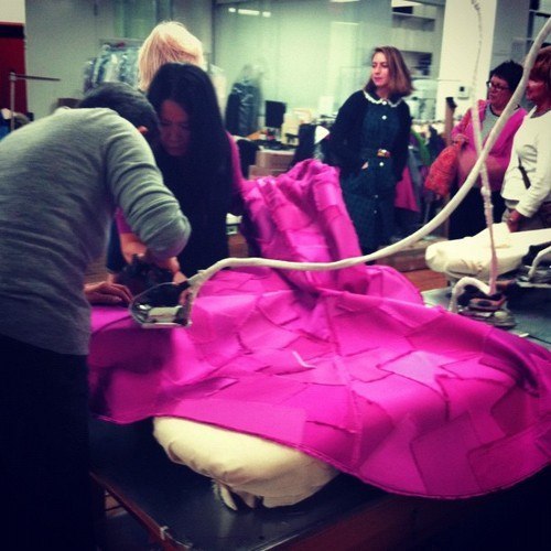
well, at this point I don't think I will say something that wasn't already said.

the red banner looks stupid and cheap.
as much as I appreciate the whole 'fashion-sketch' vibe, I was expecting much more from M&M, who can do A LOT better than this. if they went for the body shot, why the lower part of the dress is being cut in such strange way? I think it'd look much better if the pic was taken from the hip level up.
I don't mind the dress, although it's nothing extraordinary, but hey, at least it's not another McQueen's feather dress - that would just make me sick (and don't get me wrong, I quite like it, but it's already E V E R Y W H E R E).

as for Gaga, this does nothing for me. she already had so much good photos taken that cover like this is a bit disappointing. but, as it's US VOGUE, it's quite shocking for them to make such unexpected move and I appreciate that.

and I gotta admit, I already fantasise about thickness and weight of this issue and can't wait to get it!
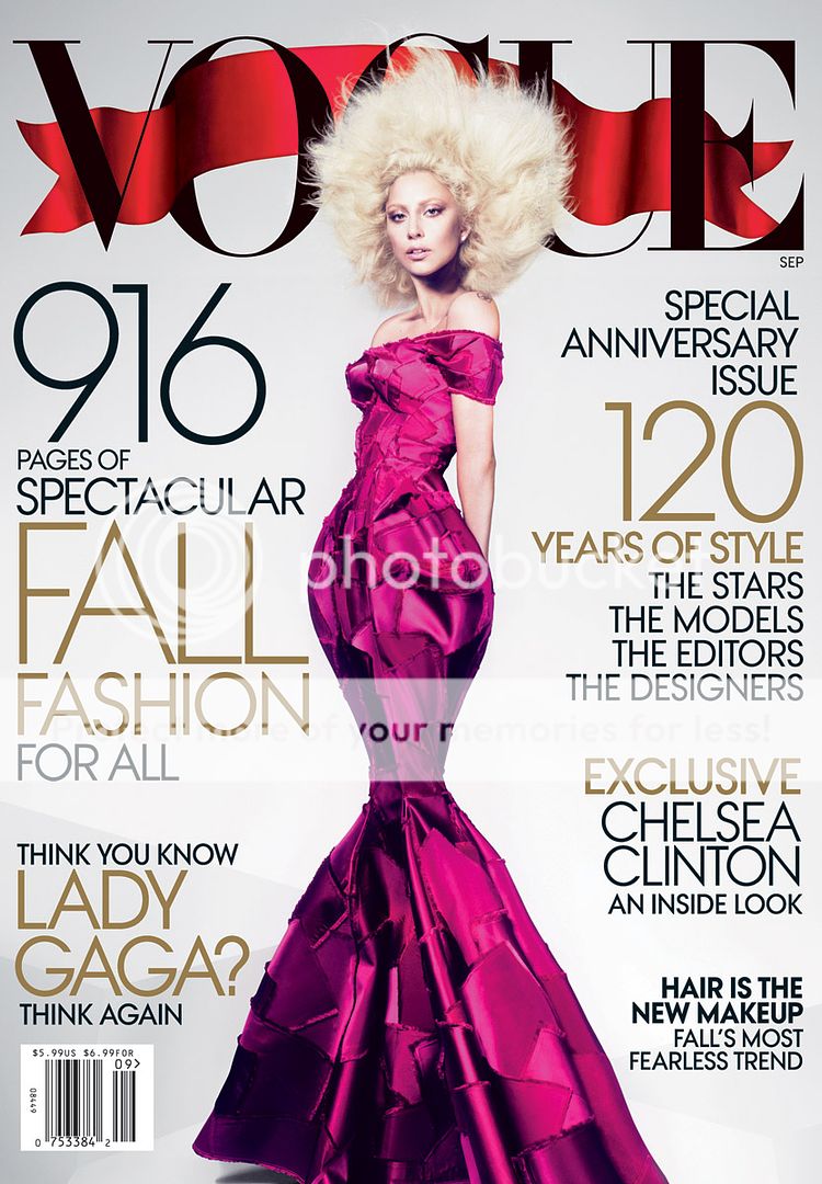
 
Last edited by a moderator:
I want to hate this cover but all the RuPaul analogies are making me LOVE it! :lol:


Gaga herself:

Who else sees me channeling Ru Paul on the COVER of VOGUE. If only I was as fierce as you b*tch. I did try to come for you with that weave. oh, and the cover story written by jonathan van meter, is the TEA.
facebook.com/ladygaga
 
Just scratch the banner in general. They couldn't even make a realistic looking banner. It looks like one of those clip art images from Microsoft PowerPoint. :lol:

I think that's what is really killing the cover for me. It really makes me appreciate those little red banners on the corner going over the 'Vogue' lettering!! :lol:

Also, is the release date for this August 21st or 14th?? Or is it just the 14th in specific locations?
 
Last edited by a moderator:

Users who are viewing this thread

New Posts

Forum Statistics

Threads
210,544
Messages
15,118,533
Members
84,206
Latest member
muggins1265
Back
Top
monitoring_string = "058526dd2635cb6818386bfd373b82a4"